Refreshed Vidyard’s brand to fit the company it had become
- Company
- Vidyard
- Role
- Design Lead
- Category
- Brand & Web App
- Year
- 2026
Vidyard is a video platform for revenue teams, the salespeople and marketers who use video to reach buyers. In 2026 it got its first real brand refresh in about a decade, which I co-led with our marketing design lead, Richelle Gagné.
Overview: growing up the brand
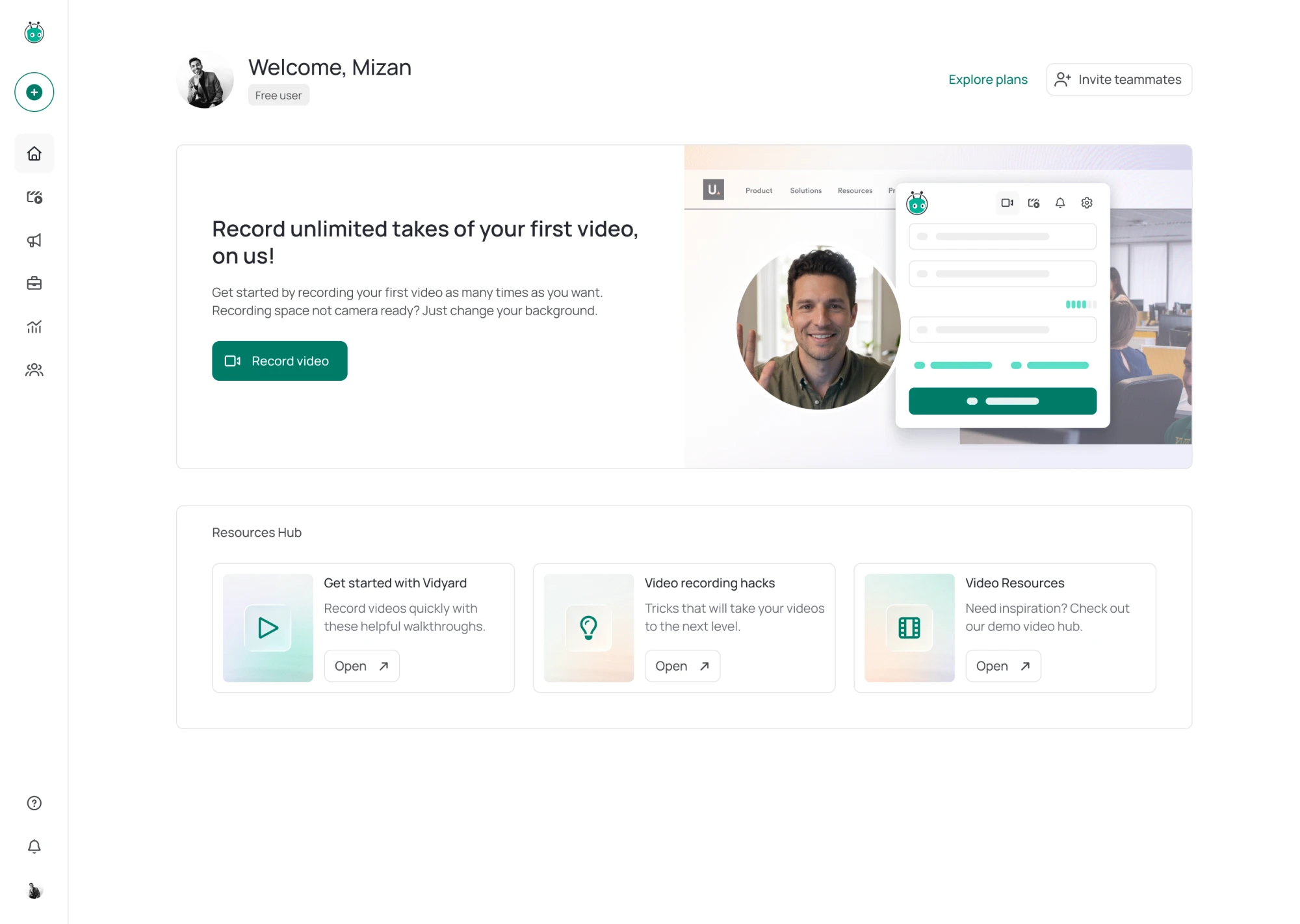
The new brand moves our green away from olive toward teal and warms the neutrals around it. It sets the product and the website in Manrope, with Libre Caslon Condensed for emphasis, and trades flat, stark surfaces for soft, textured gradients. Richelle led the identity and the website, and I led the product. The website and the product changed over on the same day.
On the product side, the question was how to grow up a brand that read as playful, almost cartoonish, without making it feel cold. In a product, a brand is mostly small rules repeated on every screen. Anything we added would show up everywhere, so most of our rules turned out to be about holding back.
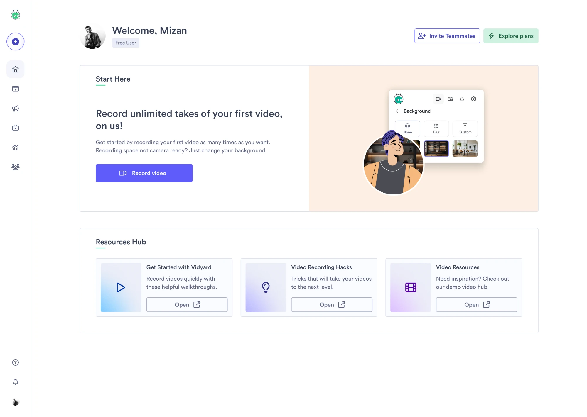
The brand we had
In testing, people read the brand as aimed at a younger, consumer audience, and in the product much of that came from the illustrations. Empty states, error pages and setup guides were drawn in a cartoon style, often with cartoon people: the setup guide on the home page had a woman singing into a microphone. The copy around them leaned on puns. When a video couldn’t be found, the page said “We looked reel hard but couldn’t find that video,” next to a cartoon woman holding up a strip of film.
The color didn’t help. Our brand was green, but in the product green had no single job: it underlined section titles, filled progress bars and toggles, and colored a bright play button and the upgrade button. The main buttons, links, tabs and checkboxes were indigo, so the color people clicked most wasn’t the brand’s.
We kept our green, which set us apart in a category where most tools use indigo and blue. We also kept VBot, the robot in our logo, because people knew it down to the icon they pin in Chrome.


The brief
Early feedback reached us through separate conversations with marketing and product leadership, so each review could reopen the one before. I pushed to get them into the same room. Before going any further, we agreed on Richelle’s brief, which came down to three words, each with a line about what it should do:
Direct. We speak plainly and back it up.
Human. We’re warm because we mean it, not because it’s expected.
Empowered. We aim to make complex things feel achievable.
Richelle and I took the direction to the executive team together. For the product, I showed the same screen before and after with only the brand changed, so the executives were reacting to the brand and not to a redesign. In the product itself, each of the three words turned into a handful of rules.
Direct
Direct meant that nothing on the screen should need decoding, and color was the place to start. The rule we landed on is that color only goes where it means something. Primary actions now use the brand’s teal, so the button people click most is in the brand color. Red is kept for danger, and tags went neutral, since their color wasn’t telling you anything. Teal tags were the obvious alternative, but the light teal they’d use already had eleven other jobs, like marking a selected item or a success message, so a teal tag looked like something you’d selected.
For years the upgrade button had a green of its own. With primary actions now teal, the two would have sat side by side meaning different things, so I argued for retiring the upgrade green instead of finding upgrade a new color. When color alone says upgrade, people learn to ignore it, the way they ignore banners. An upgrade is now a primary button only when it’s the one thing between you and what you came to do, and a default button everywhere else.
I kept the default button’s border light, because a darker one wouldn’t have told you anything the label doesn’t. The label identifies the button, at 8.45:1 against white, and WCAG doesn’t require a visible edge when a label does that. A darker border only made every default button look like a wireframe.
Human
Human meant warmth, and the question was how much of it a product screen could carry. The first warm palette I put on a real one looked dirty, so the neutrals are only slightly warm. More of the warmth comes from the type. I suggested Manrope, which keeps the clean shape of Circular, our old font, with more humanist details. We picked its weights in the browser, where people read it, since Circular had never looked there the way it did in Figma. The serif is saved for a word of emphasis in a headline and for quotes, the places where a person is talking.
Empowered
Empowered mattered most for AI, which does work for you that you can’t always see. The product already had an AI pattern, a gradient that runs around the border of AI features, but its blend of colors would have sat beside the new palette as a second one. We kept the idea and took its colors from the brand, so it’s the only control in the product where colors blend. We gave it its own easing and pace so it wouldn’t read as a loading spinner. It runs only on the thing AI is working on, not on every AI button you hover over, so you can see where the work is happening. The new pattern followed a few weeks after launch, as its own project.
The same thinking decides what replaces the cartoon illustrations. An empty state that asks you to make your first video or campaign will show an outline of the screen you’re about to create, so you know what you’ll get before you start. Smaller empty states will get a simple icon.
Getting it into the product
Color can only mean something if the product knows what each color is for, so every color also had to be named by its role, in Figma and in the code. Marketing and product had always designed from separate Figma files, which is how even our primary button had drifted into two slightly different colors. We merged them into one library for both, with the pieces only marketing uses, like 64px display type, labeled so product designers know to skip them. I handed the rebuild to Prerna Vinod, a product designer on our team, who put it on semantic tokens: names that say what a color is for.
Figma could hold the look but not the behavior, like how far a button shrinks when you press it or how long a message stays before it goes. Richelle had started a token page, and I built it out with Claude into the spec for the whole system: every token and component, each state laid out, a live copy you can press, and a note beside each decision that wasn’t obvious. Because it was a live page, the design team could review the real components while they were still easy to change. Our engineers built from it, and so did the agency that builds our website.
Building from the spec only went so far, because much of the product didn’t use the components or read its colors from tokens. An audit I ran with Claude found our default button in 983 places, with only about 400 using the component. Juan Carlos Corona Romero, who led the build with Aric Wolstenholme, found colors hard-coded in some places and named inconsistently in others. Juan proposed mapping every color in every component to a role before changing any values, and we made that the plan. Juan built a tool to do the mapping, and Claude drafted the changes component by component for engineers to review.
Mapping first made the foundation most of the work. We had to ship before a large industry event in September, about eleven weeks after we started, so I narrowed the launch to the screens a seller at our booth would show a visitor, from sign-up to the Chrome extension. Those needed the new logo, type and color, and everything else could follow. Before launch, I set up two testing sessions with the design team, where we checked every screen in scope against the new brand, in every interactive state. Engineers joined at the end of each one, so we could sort what had to be fixed before launch and what could follow. The whole refresh sat behind a single switch, so the product changed all at once instead of piece by piece.
Reflection: one brand on day one
A refresh that stopped at the website would have left customers on the old brand in the product they use every day, and someone who signed up at our booth at the September event would have landed in a product that looked like a different company. So the product had to change with the website, not after it, and that meant getting marketing, product, design and engineering onto one plan.
Marketing and product leadership each had their own picture of the refresh, so I brought them together early to agree on one brief. For engineering, I wrote down exactly which screens had to change for launch and why the rest could follow, so they had a scope they could estimate and commit to. I took the date that came out of it to leadership and marketing, so the whole company planned around the same day. And I brought decisions to the design team early and often, so the rules we shipped had the whole team’s input.
My test for scope was one question: would a visitor see it at our booth, or right after signing up? Those screens changed for launch, and the rest, with less traffic and more one-off parts, could follow. That meant setting aside good ideas, including some of mine, so each went on a list with the reason it could wait, and that list became the plan for the rest of the product after launch. I stayed on the refresh to see it through, so the launch was the first step of the work rather than the end of it.
Acknowledgements
The refresh was the work of many people across marketing, design and engineering. Richelle Gagné co-led it with me from the marketing side, and Aric Wolstenholme and Juan Carlos Corona Romero led the build on the engineering side. Thanks to everyone across design and engineering who built and tested it.